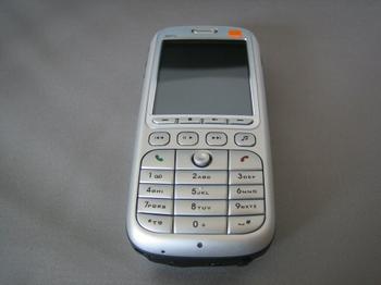
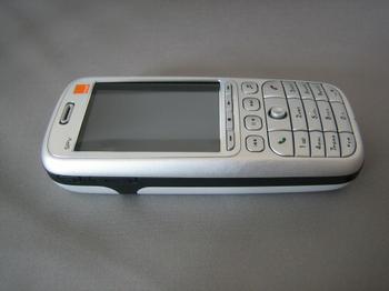
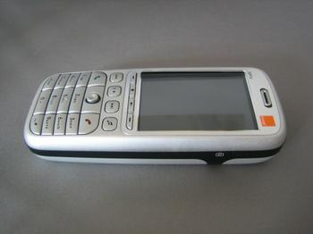
Looking Closer - Front
With the release of the SPV C550 handset, Orange has a pleasing-to-the-eye design which instantly looks more organised than the SPV C500 it succeeds. The button layout on the phone has been reworked to provide quicker access to the multimedia capabilities of the handset, along with easier navigation for both web use and general handset navigation. The clumsy joy pad from the SPV C500 handset has been thrown out and replaced with a much simpler, but more effective joystick, which is accompanied by the usual call receive/end buttons on each side.
On the left hand side of the phone are three discrete buttons, the far left is a single button that launches the web browser on the handset and the two to the right of it are the up and down volume control for the handset earpiece.
On the right hand side of the handset is a button that is now making a common appearance across all recent handset designs, the one touch camera application.


