Introduction
I must confess to being in the same boat as many HEXUS readers when it comes to smartwatches and fitness trackers. I've never really felt the need to get one; I'm happy enough with my fitness; I know when I've had a good night's sleep; I definitely don't need more notifications in my life, and since I adopted a smartphone many moons ago, I've enjoyed not having to wear a watch.
But I'm always willing to try something new, and when Fitbit offered to send in its best-selling tracker, the Charge 2, I decided to give it a go. After spending a few weeks with the device strapped to my wrist, I'm starting to see what all the fuss is about.
Design
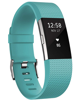
One area in which wearables have improved considerably in recent years is appearance. Today's smartwatches could easily be mistaken for a regular watch, and bands such as the Charge 2 can pass as a fashion accessory. Measuring just under 22mm wide, the bracelet-like device isn't overly large, though the monochrome OLED display isn't quite as roomy as we'd like. The pictures suggest that the display fills the entire void between straps, but in reality there are chunky bezels - the screen itself measures roughly 13mm (W) x 21mm (H). That's big enough to display a reasonable amount of data while being easy to read, however we hope Charge 3 is able to better utilise the available space with an edge-to-edge display.
Simplicity is a key selling point and, despite a wealth of available features, the device features only one button. Located on the left side of the screen, this can be used to toggle through menu options, while a longer press acts as select. It is interesting to note that Charge 2 isn't equipped with a touchscreen, however it does feature a tap display. This works by sensing vibration, but it can be finicky during use - we've found it to be more reliable when tapping the band, rather than the screen, which has the added benefit of keeping fingerprints off the display.
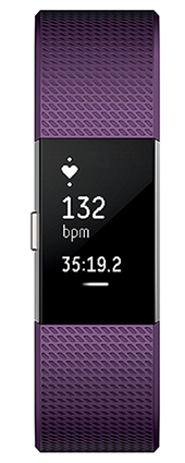
Available at around the £110 mark, Charge 2 is designed to appeal to a mainstream audience, and can often be found in the sales; Amazon had the tracker listed at £80 in last week's Prime Day event. The price tag makes it accessible, and Fitbit offers a trio of sizes to ensure a comfortable fit. As illustrated, Charge 2 comes in a choice of colours, as well as pricier Special Edition variants, and the band is interchangeable. Don't however feel the need to splurge on official Fitbit accessories; the popularity of Charge 2 is such that a number of third-party suppliers have made available compatible bands from as little as £5.
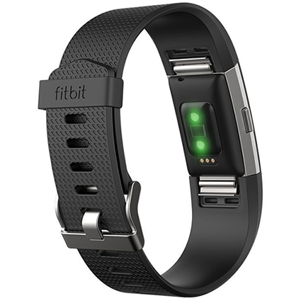
In terms of tech, you're getting a quartet of sensors designed to monitor heart rate, steps taken, floors climbed, and sleep behaviour. The optical heart-rate tracker, three-axis accelerometer, altimeter and vibration motor are neatly implemented into such a small form factor, yet this is a mid-range device that lacks some of the more advanced features available to premium competitors. There's no built-in GPS, no gyroscope, no ability to store music, and though Charge 2 is water resistant to protect against rain, sweat and splashes, it isn't waterproof, so you'll need to remove the tracker before going for a dip in the pool.
Software Ecosystem
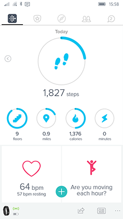
It can't cost a lot to produce a wearable with the aforementioned sensors - that'd explain why there are numerous low-cost imitations now on the market - yet Fitbit continues to stand out courtesy of its widely available and constantly improving software ecosystem. Apps are available for Android, iOS and Windows, and I'm genuinely amazed to see such comprehensive availability. This may well be the first smart device I've owned that has a robust web interface, as well as decent apps for Android, iOS, and Windows. Heck, it even works on my ageing-but-reliable Windows Phone. The only snag for Apple users is that there's no native iPad app to go alongside the iPhone variant, which is a shame as the iPad would be a nice screen for browsing results.
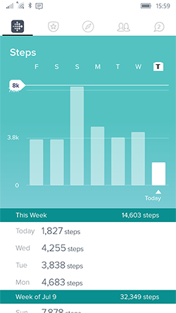
Charge 2's strength is its ability to do the simple things well. The initial setup and pairing process is painless, and when you're wearing the watch (on either wrist), the bulk of the activity tracking happens automatically without any intervention from the user. Steps taken, distance travelled and floors climbed are tracked at all times, heart rate is monitored constantly, sleep patterns are recorded, and the resulting data is collated in clean-looking pages that won't bamboozle those who aren't entirely tech savvy.
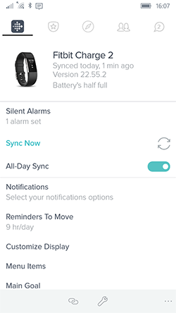
Given the lack of on-device controls, the apps are also tasked with settings and customisation. Charge 2 offers a choice of clock faces, as well as the ability to tailor menus and smartphone notifications to your liking. Being able to see incoming callers, text messages and calendar events on your wrist can be handy, but it's a sign of Charge 2's mid-range credentials that the notifications can't be acted upon - you'll need to reach for your phone to answer a call or reply to a text.
What Fitbit excels at is motivation. Charge 2 will vibrate when you've been inactive for too long, and in addition to notifications on the app, you'll get cute on-device prompts such as "take me for a walk?" when you're idle or "BOOM" when you've had a particularly good session. You'll also obtain Xbox-like achievements - I've just been awarded a 'Skyscraper' badge for climbing 100 floors in a day, hoorah for me - and if you're already signed-up to third-party services such as MyFitnessPal or Strava, Fitbit's data will happily synchronise across.


