Living with Windows Phone 7
My thoughts on a long-term relationship Microsoft’s latest entry into the smartphone market.
If you have any interest in the mobile phone market – or technology in general – you’ve probably already read one of the hundreds of Windows Phone 7 reviews out there. You probably have a good idea of the good, the bad and the potential of the OS and may have already have your own opinions on it.
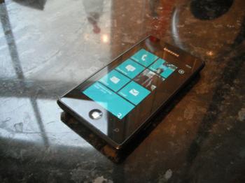
I purchased a Samsung Omnia 7 just a few days after the European launch on October 21, tying myself into a two-year contract. Rather than write ad nauseam about the hardware and rehash much of what has been commented upon already, I’m going to take a different tack and evaluate what it’s like to live with the fledgling Windows Phone 7 operating system day in, day out.
Are the problems with the platform enough to be a major inconvenience, or are they the sort of thing that wouldn’t bother a normal person? If you lock yourself into a two-year relationship with a Windows Phone are you likely to regret the decision a few months in?
Speedy Gonzales
The first thing that everyone notices when they first play with a Windows Phone 7 handset is just how smooth everything is. Zipping around the homescreen is effortless and never frustrating. For all of the pretty animations – and there are many – I’ve never once seen the phone struggle to load a screen. On very rare occasions the OS will stutter a bit, but the longest you’ll normally have to wait is for the animations of moving to a new screen to run. Simply put, unless your attention span can only be measured in nanoseconds, you’re unlikely to be bothered by moving around the OS.
This is clearly down to the optimisations made possible by a tightly-controlled hardware ecosystem. There’s been a bit of criticism surrounding this decision, but once you see how highly polished the OS is, you’ll know that Microsoft made the right move.
It’s also remarkably intuitive, although I get the feeling that some iOS users might take a bit of time to adjust. The ‘up/down’ paradigm of the home-screen and the relatively small number of apps on display might take some getting used to for the Apple faithful, but you’ll very quickly get up to speed, especially after you’ve pinned your favourite games and contacts to the main menu.
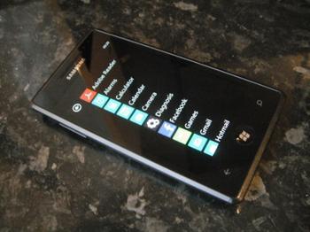
The problem – as has been laboured – is that the app list contains almost everything installed on the handset. It works sensibly, but unfortunately, that doesn’t mean it works particularly well. All of the apps are listed alphabetically so finding what you need is fairly trivial and, with a factory-fresh device, relatively quick. However, it’s easy to imagine that the list would quickly become unwieldy if you’re an appa-holic.
Just a big ol' list
Unfortunately, there’s no way to search, group or rearrange the apps. In honesty, it’s very functional and fine for the majority of users – myself included – who tend to stick to the more-basic functions of the phone along with just a few installed apps, though I could see it causing problems for a power user. There’s also no way to pin games to that menu, meaning that you either have to go through the Xbox Live app, or return to the homescreen if you have it pinned there – a simple omission that really doesn’t make any sense.
Elsewhere, the level of polish remains consistently high. The on-screen keyboard is perfectly workable – although a little small for my large fingers in portrait mode – and the autocorrect is universally excellent. There are certain screens that refuse to auto-rotate, although this seems to be app-specific since all of the basic functionality – but not all of the Microsoft apps...I’m looking at you, Maps – seems to spin around just fine, with the glaring exception of the homescreen and app list.
One of the hot-button topics for WP7 – even before release – is the lack of cut-and-paste, and I’d be remiss if I didn’t mention it. Microsoft claimed that it wasn’t necessary – even though it’s going to be included in an forthcoming update – because of how contextually aware the OS was. If there’s an e-mail address or a phone number, you can use it or add it to your contacts with just a few taps. For the most part this is true, but you can’t escape the feeling that your hands are artificially tied. The fact that it doesn’t extend to addresses or postcodes makes this all the more glaring and at times, quite frustrating.
Hide and seek
Another one of the big design decisions in Windows Phone is the way that search is tied into everything – there’s even a search button built right onto every handset. On the one hand, this is brilliant, and once you get used to it, you can jump very quickly to a web search to find whatever you need. It’s also context aware, so hitting the button in the marketplace or your inbox will search through the respective areas.
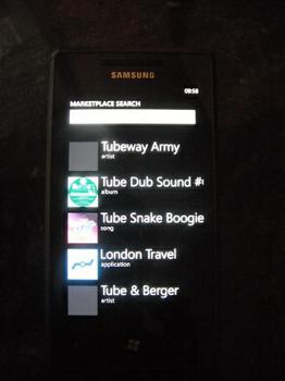
This is handy and all, but there’s no real way to sensibly filter what the search is finding. This is most apparent in the marketplace, where – even if you’ve first navigated into a sub-category like news apps or music by a specific artist – the search will bring up results from all categories, sorted only by some unfathomable relevance metric. For instance, while searching ‘tube’ in the ‘apps’ section for something to help me find my way around the London Underground, the results list will be filled with the hits of Gary Numan’s Tubeway Army. Not especially useful. The idea of a single, unified storefront is nice, but with no way to easily filter apps from songs and videos it just seems a little bit half-baked, and ends up more frustrating than anything else.


