Introduction
It was way back at Computex that Cooler Master first announced plans to refresh its flagship line of PC chassis with a pair of new offerings. The all-singing, all-dancing Cosmos C700P arrived a couple of weeks ago promising everything but the kitchen sink for enthusiasts willing to hand over £280, but if that's too dear for your liking, you may have decided to wait for the more approachable MasterCase H500P.
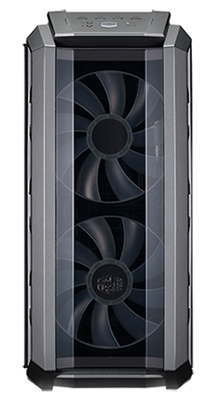
Officially launched today at a cost of £135, the H500P is a modern-day reimagining of Cooler Master's popular range of HAF enclosures. Described simply as "the must have chassis for people who require High AirFlow," the H500P's signature feature is a pair of extra large 200mm front intakes guaranteeing a plentiful supply of clear air. There's more to it than that, mind, so let's take a closer look.
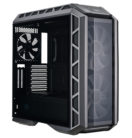
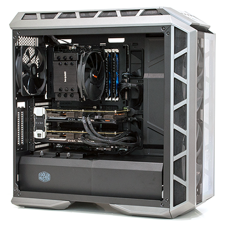
It is fair to say the external aesthetic will divide audiences, but we actually quite like it. The H500P is one of those cases that looks better in the flesh, with the rugged-effect top and front panels contrasting well with the shades of grey and tinted side mirror. We particularly like the fact that the top and front feature large transparent sections, allowing the user to peer into the machine from most angles, and the tempered glass side panel is one of the best in the business. Cooler Master now uses a lighter tint so as not to obscure your hardware, the locking mechanism is mounted top-centre, and the panel sits on hinges so as not to fall out when unlocked.
The external design looks the part, but when you start to explore the H500P you quickly begin to notice where compromises have been made. Those dual 200mm front intakes, for example, promise plenty of air but result in chassis dimensions ballooning to 650mm (H) x 345mm (W) x 640mm (L), making this one of the bulkiest mid-tower solutions on the market. And though the steel core is suitably rigid, the front and top covers are almost entirely plastic and lightweight. Both sections are easy to remove, but don't come close to matching the quality feel of the glass side panel.
Build quality is nonetheless good enough, with the plastic adornments clicking into place without any obvious seams or rattles, but Cooler Master has missed a trick by not updating the front I/O panel. The angled section on the top cover includes two USB 3.0, two USB 2.0, a pair of audio jacks and a backlit power button, but in late 2017 the absence of USB Type-C could be a deal breaker for some.
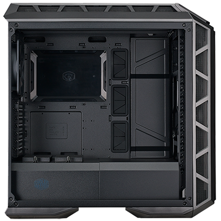
Step inside and you have a pleasant workspace with ample room to manoeuvre, including 412mm of clearance for graphics cards and 190mm clearance for a CPU cooler. Lots of cooling potential is the name of the game, and the H500P doesn't disappoint. The front of the chassis can accommodate three 120/140s and there's room for the same configuration in the roof, allowing for up to a 360mm radiator in either location. What's handy is that a front radiator can be mounted on the inner side of the front panel, leaving the dual 200mm fans in place to create a push/pull setup. All that's missing is somewhere to easily fix a reservoir and pump.
The good news for those of you who can't get enough RGB is that both 200mm fans are illuminated and outfitted with dedicated RGB headers for compatibility with motherboards from the likes of Asus, Gigabyte and MSI. Cooler Master also bundles a three-way splitter, for attaching multiple RGB fans to a single header, but the firm's transition toward modular MasterCase accessories means there's also a fair amount of kit not included as standard.
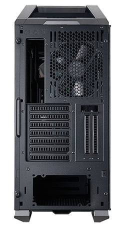
The plastic front cover can flip down to serve as an easy access door, yet while we've appreciated the feature on earlier MasterCase chassis, this time around there are no 5.25in optical bays to get easy access too. Similarly, two additional expansion slots hint at vertical graphics card mounting, but using them means purchasing a £45 holder kit, and despite the size of the case only four drive trays are provided as standard - a duo of 2.5/3.5in trays in a cage at the end of the PSU compartment, and a pair of 2.5in sleds sat on top.
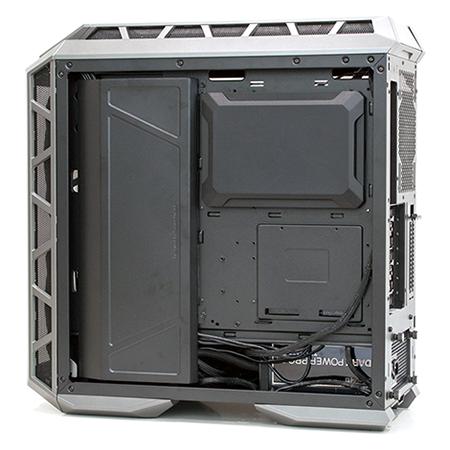
Keeping cables tidy isn't much trouble due to holes above and below the motherboard tray, as well as three large rubber-grommeted sections to the side, but Cooler Master goes a step further with a cover that clicks onto the cutout in the motherboard tray and a second cover that screws on top of the area where the bulk of the cables reside. Putting the covers in place can make a tidy build even neater, yet we do question the benefit on a chassis with a solid rear side panel - the cables are automatically hidden on a completed build, so is there any need to put covers within a cover?
On the whole building our ATX test platform into the H500P was a breeze, but do be aware that using an E-ATX board would obscure a good portion of the rubberised routing holes, and if we're nitpicking we would have preferred an option to insert the PSU from the back. As it stands, the PSU shroud has to be unscrewed and removed before the supply slots into place. Other than that it's easy going, and the only question mark that remains is whether or not the mesh sections on the sides of the front panel do justice to the 200mm fans lurking beneath? Let's take a look at performance.


