Introduction
Most PC gamers are advised to get their hands on a mechanical keyboard. It's sound advice, as nothing beats the precision of a mechanical key, but while a distinct actuation point and n-key rollover can be beneficial to enthusiast gamers, there are downsides. Mechanical keyboards tend to carry a premium, and if you've never used one before, you might be surprised to find how loud they can be during use. So what do you do if you want a gaming keyboard without all the clicky-clacky noise?
Roccat reckons Horde Aimo is the answer. Priced at £90, this intriguing keyboard employs so-called "membranical keys" that claim to offer "the perfect compromise between membrane and mechanical."
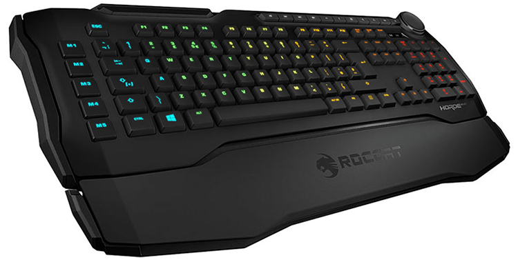
Top marks to the marketing department - membranical sounds so silly we can't help but like it - and on paper the keyboard seems an excellent choice for those who can't abide the noise created by mechanical alternatives. One thing you know you're going to get from a Roccat product is a bullish aesthetic, and Horde Aimo doesn't disappoint with an oversized footprint and lots of angular accents that you're going to love or hate.
It's an acquired taste, yet while the design is too busy for our liking, those who want a gaming keyboard that looks like a gaming keyboard ought to feel right at home. Unfortunately, and as is too often the case with gaming gear, it also feels somewhat cheap in parts. Plastic construction results in a bit of flex around the centre of the keyboard, and though it's always nice to have a bundled palm rest, the one on offer here is lightweight and lacking the textured grip available from various competitors.
Membrane vs. Mechanical
Horde Aimo doesn't convey a premium feel - it even lacks the USB passthrough we've come to expect on gaming keyboards - yet there are some intriguing features that carry plenty of promise. Firstly, the membrane-based keys are perfectly decent. Unlike mechanical boards, whose keys are separate, membrane solutions use full-size layers that register input when a key is pressed to create an electrical circuit between an upper and lower layer.
Roccat's rubber-domed mechanism is well-put together. The keys feel quick and springy, with a good amount of travel, but they naturally lack the precise actuation point of a mechanical switch. Roccat advertises a "midway travel actuation point" but we found that key presses would only register when bottoming out. This isn't really a hybrid as Horde Aimo doesn't replicate the plus points of mechanical switches, yet it's a very good membrane, and that means it's one of the quieter gaming keyboards around.
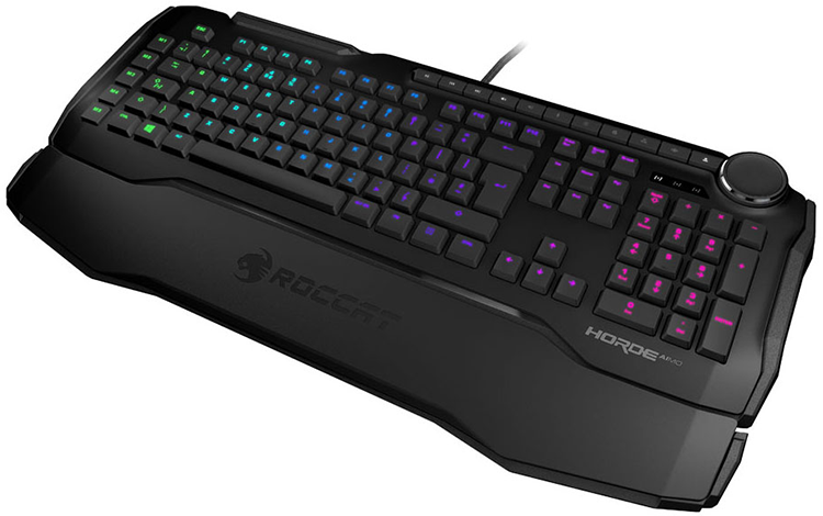
The use of island-style keys should help keep things tidy in the long run - there are smaller gaps for dirt and grime to gather - however lighting suffers as a consequence. You lose the under glow available from mechanical keys, and for a keyboard that emphasis RGB illumination, Horde Aimo is unexpectedly timid. We're told to expect an "intelligent, organic, and evolving" lighting experience that adapts to your play and becomes more dynamic with use, but there's a problem; the lighting is so dim it is barely visible in a naturally-lit room.
Dim lighting, promising wheel
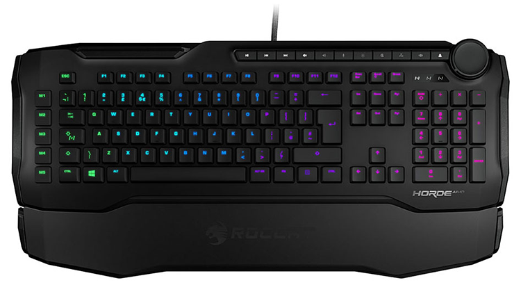
Weak RGB lighting is a surprise given that Roccat has high hopes for its Aimo ecosystem, and it's a shame as Horde Aimo is solid in most regards. Rubberised pads on the underside help keep it well planted, the 1.8m braided USB cable is tidy, and we particularly like the dedicated column of macro keys on the left side. These can usually be off-putting if you're quickly trying to locate Ctrl or Tab, however Roccat uses a half-height design that makes it easy to distinguish the macro keys from the rest, limiting the risk of accidental presses.
What's interesting is that after a week of regular use, it isn't the membrane keyboard that has caught our attention, it's the "tuning wheel" in the top-right corner. Taking the place of a volume roller, the wheel proves notably useful and can be thought of as a makeshift Surface Dial. Well sized with 360º rotation and 20 notched steps, the wheel feels accurate to use and is partnered by a row of shortcuts alongside the multimedia keys that allow you to toggle between settings such as microphone volume, brightness, and task viewer. The ability to quickly adjust such settings is useful, but what we really like is the ability to hold the button closest to the dial to bring up Windows 10's built-in wheel interface.
Having a wheel on the desktop is something we can see ourselves using on a regular basis, yet Roccat's implementation does leave room for improvement. The disappointments are twofold. Firstly, the wheel isn't clickable - you can use the button to the left as a clicker but it isn't quite as intuitive - and, secondly, the wheel is in the wrong place. It's usable on the right, but we'd much prefer it on the left, allowing us to turn the dial while using a mouse at the same time.


