Sod's Law - no change there!
The problems I encountered fell into two basic categories. First there were my own mistakes - not creating a proper style sheet before I started, not using web-standard fonts and colours, not reading the software manual, not doing enough research on how a site actually works and countless page-format and hyperlink errors. The list goes on and on.
Then there were problems over which I had no control.
There were – and still are - tourist boards and organisations that change web addresses or remove sections of their site for no good reason and leave you with dead links.
I also hadn't anticipated the way that something that looks good in one browser could look so different and often awful in another.
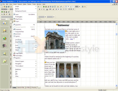
Namo WebEditor 6 - Insert menu
(click for larger image)
Next was the discovery that features I'd come to rely on don't actually exist in all browsers. Aaaagh!
What also came as a seriously unpleasant surprise was that certain features can simply disappear in new versions of browsers.
To this long list can be added a plethora of unexplainable software glitches and crashes that seem to be the lot of the computer user.
I dread to think of what kind of special misery I could have inflicted on myself had I decided to learn HTML as well.
One thing I thought would be easy was the photography. I already had a lot of good pictures of some of the destinations that would be featured. But very quickly I came to three extremely irritating realisations, starting with the fact that what looks impressive as a 10x8in glossy print doesn't necessarily work as a tiny picture on a web page.

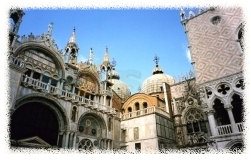
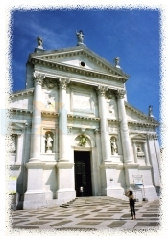
A couple of
tiddlers that, hopefully,
you'll agree, do look impressive!

you'll agree, do look impressive!

Then it became clear that if you want to end up with 20 to 30 pictures on any particular page you have to start with rather more than 20 to 30 pictures.
Further, ideally, everything has to be shot at different angles and in portrait and landscape formats where possible. Generally I've taken around 300 to 400 pictures for each city, so a digital camera turned out to be a must.
The final realisation was that I had to break a lifelong photography habit - cropping my pictures as I take them. In particular, it was no longer a good idea to crop out members of the public getting in the way of a perfectly good shot. Leaving plenty of cropping room gives me a lot more control over how I use the shot on the site and leaving in the tourists adds life and interest.
Once I've decided how I'm going to crop the picture and whether it's going to be portrait or landscape format, I then reduce the image file size to around 40Kb, to ensure that pictures load quickly and at speed acceptable even to those using dial-up connections.
Finally, I lightly airbrush around the hard edges of the picture - using Paint Shop Pro, another program I've found easy to use - because I think this makes them look better on the page. I've experimented with other techniques, such as putting a drop shadow behind the picture, but nothing seems to work as well as airbrushing.
By the end of August 2006 I had completed three city guides and was ready to launch the site.
I wrote a short press release and a friend prepared an email list of travel journalists and writers.
But, of course, I'd been forgetting the most important thing of all, Sod's Law squared...


