Design
Whether or not Microsoft has long-term plans on becoming a serious player in hardware manufacturing remains to be seen, but one can only hope, as from an engineering standpoint, the Surface is a thing of beauty.
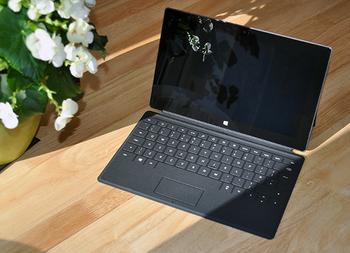
And in an exclusive sort of way, too. Many a tablet has followed in the footsteps of the iPad, but to Microsoft's credit, the Surface looks... well, like a Surface. It has a unique feel about it, with edges angled at 22º and a smooth, dark and serious-looking exterior.
The chassis, built from a magnesium alloy that Microsoft dubs VaporMg, is fantastic to hold and has a premium feel about it. The dark-grey shell is prone to fingerprints, but it cleans easily and, more importantly, it's very solid.
Such is the quality of material that the Surface actually seems heavier than it is. Microsoft's device tips the scales at just over 670g (just a smidge more than the 652g fourth-generation iPad), but the perceived strength of the shell, coupled with rigid angular edges, give it a greater sense of heft - it's almost like holding a book.
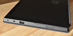
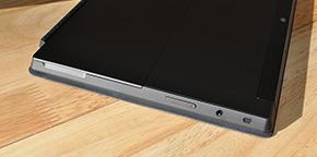
By opting not to taper the edges of the device to give the illusion of being ultra-thin, Microsoft instead has plenty of space to insert various I/O ports, and duly obliges. The power button sits on the top-right edge, the left side sports one of the device's two stereo speakers, a headphone jack and volume rocker, while the right edge is equipped with the other speaker, micro-HDMI output, a full-size USB 2.0 port and a proprietary, magnetic power connector that surprisingly still needs a bit of a wiggle in order to sit correctly.
It's a shame Microsoft hasn't adopted the more up-to-date USB 3.0 standard, but the I/O selection is well above average for a tablet, and it's further enhanced by a microSDXC slot that allows users to expand on the default 32GB/64GB capacities.
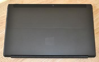
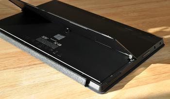
The microSDXC slot is tucked neatly beneath an integrated kickstand, which is a treat in its own right. Opening and closing with a satisfying click, the kickstand feels almost as robust as the rest of the chassis; an impressive feat considering its thin profile.
The kickstand works well on a desk, where it props up the Surface at a 22º angle, but it does have a few limitations. Firstly, it's opened by a pulling at a groove on the left side, but there's no such aid on the right, making it difficult to open from the other end. And, if you're aren't sat head-on, you'll be disappointed to find that the kickstand angle can't be adjusted - it's take it or leave it.
That said, we'd certainly take it, as the kickstand has become a feature we use on a daily basis. So much so, that we now yearn for such a feature when we revert to other tablets.
Microsoft has shown that it has the wherewithal to produce attractive hardware, but the Surface does have shortcomings. The current model lacks two significant features - GPS and mobile broadband connectivity (it's WiFi or nothing) - and the widescreen format imposes a few quirks of its own.
Quite a few of us sneered at Apple for not opting for a true widescreen display in the iPad, but the fruity folk might know a thing or two, as the Surface's 16:9 widescreen display makes it feel unusually long. It's easy to get used to in a landscape orientation, but flip to portrait and the tablet seems too tall and thin - to the extent that we've found ourselves using it exclusively in landscape mode. But even then a few niggles remain. The touch-sensitive Windows Start button - which vibrates delightfully when pressed - is positioned at the centre of a long edge, putting it out of the reach of your thumbs when used in the preferred orientation.
Perhaps it's a result of being first to market, but whatever the reason, the squarer iPad form factor feels more natural to hold. But on the flip side, Surface's long angular shape provisions for a healthy set of I/O ports and a surprisingly-competent keyboard.


