Cooler Master Cosmos - one step closer to production
 While visiting Cooler Master’s factory in HuiZhou, we heard that newer (T2) engineering samples of the Cosmos chassis were lurking on a dark deserted floor in one of the buildings.
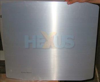
Not wishing to deprive our readers of vital info, we negotiated with our hosts who allowed us to take the following pictures. These samples still aren’t final production design so are likely to change slightly before production.
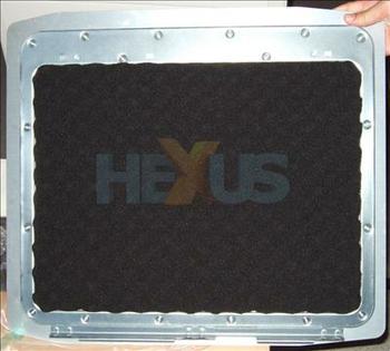
As you can see above, the foam used to line the side-panels is convoluted, rather than flat.
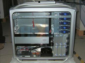
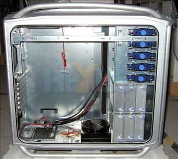
The PSU sits down low and on top of a grille - allowing it to draw in air through the bottom of the case. Also unusual is the adjustable fan-intake near the front. This lets you guide the incoming cold air pretty much where you like.
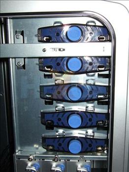
As seen in our original headline, based on an earlier T1 engineering sample, the Cosmos is going to be using new and exclusive push-button-style tool-less clips for its 5.25in drive bays.
In the image above, we're looking at the top of the case not the front. This shows another eye-catching and novel feature - the top exhaust fan system that's located at the back end. Possibly inspired by the Delorean from the Back To The Future trilogy, we wonder?.
But we're not just talking looks, here. This setup should provide a decent exhaust path for heat produced by the CPU and motherboard VRMs.
Also on the top of the case - but towards the front - is a decent cluster of ports. As well as USB 2.0, FireWire, mic and headphone there's also one eSATA - the up and coming go-faster port for external drives.


