A new-look user experience
In part three of our Windows 7 review, we'll turn our attention to the user interface. Reflecting on what the average home user can come to expect, we'll be focusing on Windows 7 Home Premium.
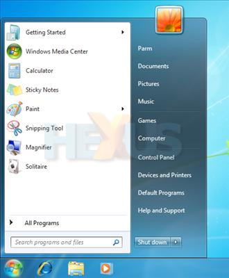
At first boot, Windows 7 doesn't look all that different to Windows Vista. The transparency effects are still present, and the Start menu looks familiar. Dig deeper, though, and there are plenty of changes afoot.
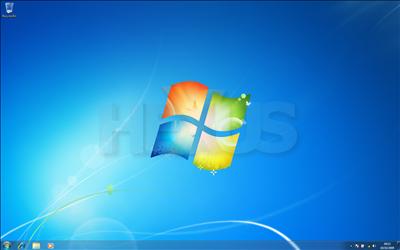
One of the first things we've noticed is that Windows 7, in its default state, looks very, very simple. In contrast to Vista, there's no pop-up Welcome Centre, no pre-loaded Sidebar Gadgets and very little clutter in the system tray. Instead, you've a sole Recycle Bin on the desktop, and a trio of icons in the quick-launch area; Internet Explorer, Explorer and Windows Media Player.
The simplicity of it all isn't a coincidence, because what we seem to have with Windows 7 is a clean slate - for both Microsoft and the consumer. Yet, despite the crisp, clean look, there are a number of UI enhancements designed to improve the end-user experience.
The new-look Windows Taskbar
At first glance, the Windows Taskbar looks familiar, but it's slightly larger than the older version found in Windows Vista - measuring a couple of extra pixels in height. There's reason for this, too, as the well-sized Taskbar buttons are now better positioned to be used via touchscreen interaction.
But there's more to it than that, as the Taskbar has been given its biggest overhaul since its introduction in Windows 95. For better or for worse, it's now something of an amalgamation between the traditional Windows Taskbar and Apple's Mac OS X Dock.
Taking the above-populated taskbar as an example, you can see that both shortcuts and open applications now reside in the same space - as opposed to shortcuts living separately in what was previously the quick-launch area. The change makes the taskbar more Dock-like in use, and it consequently needs a handful of visual indicators to help guide the user.
In the above example, icons with defined borders show open applications, whereas those without are merely shortcuts. Similarly, the multiple borders surrounding the Internet Explorer icon highlight that more than one instance of Internet Explorer is currently open. It's an interesting development, and one that makes far better use of the Taskbar's available space. The Start Menu is starting to look a little redundant, such is the room for shortcuts and open applications
Continuing taskbar refinements, both open applications and shortcuts can, for the first time, be rearranged - a first for any Windows operating system. Highlighting the attention to detail, the Taskbar features subtle mouse-over properties to make it easy on the eye. Put the cursor over any active taskbar item and it will tint the item's background to a unique colour - which specific colour is calculated by dynamically abstracting the most dominant RGB value of the application icon. For example, the Media Player icon will tint orange and the Internet Explorer icon will turn blue, and so on. A very nice touch, we reckon.
Fortunately, for those unaccustomed to change, it is possible to revert to labelled icons, as shown above. Having used Windows 7 in various versions and builds throughout the year, this is one user who, despite appreciating Microsoft's best efforts, hasn't been able to acclimatise to the combined and label-less new Taskbar.
Over at the other end, Microsoft has again attempted to clear up Taskbar clutter by limiting the number of icons in the notification area. However, the software giant's attempt to do so isn't as useful as it seems. Instead of allowing users to prevent items from loading with Windows (a feature available via Windows Defender in Vista, but not in 7) - excess icons are now simply tucked away behind a "show hidden icons" button. It looks neater, sure, but that isn't to say you don't have a horde of icons and notifications hiding behind the scenes.
The peculiar-looking box to the right of the taskbar is the replacement for show desktop. It's now dubbed "Aero peek" and requires a simple mouse over to temporarily peek at the desktop, whilst a single click minimises all open windows.


