Windows Aero, take two
Aero, the graphical user interface introduced in Windows Vista, has been given a significant overhaul in 7. What was once seen as little more than superfluous eye-candy has been transformed into a tool designed to improve productivity.
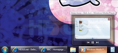
We're actually big fans of what Aero can now achieve, so we'll just filter through a list of reasons why we love it so. Firstly, the transparency effects are now being used for function over form. As shown in the above example, users can hover over an open application in the Taskbar and Windows Aero will focus attention to that window, making all others transparent. It looks cool, and it's useful.
If, say, you're insistent on using the new-look Taskbar layout, it's an essential tool at finding what could be one of many web-browser tabs - and we might add that the transition effects whilst switching between them are silky smooth.
It's worth noting, also, that the Taskbar previews are all live, showing in real-time the content of that particular app. Extending that functionality, previews for apps such as Windows Media Player provide the ability to pause or skip tracks.
Snap it, shake it, aero flip it
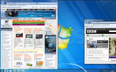
Arguably our favourite new feature in terms of everyday productivity is Aero Snap. Allowing multiple sources of content to be viewed side-by-side with ease, it snaps windows to the left or right sides of the screen and resizes them to 50 per cent of the desktop real estate.
When used with big-screen displays, it's a feature you soon find yourself unable to live without. Aero Snap can be used by dragging a window to either the left or right edges, or via keyboard shortcuts (Windows key + left/right arrow). Similarly, dragging a window to the top will maximise it, whilst pulling it away will restore down. Simple, but mighty effective.
Another crowd-pleaser, Aero Shake helps declutter a desktop by focusing attention onto a single window. It works by grabbing a window by its title bar and literally shaking it. All other open windows are minimised, and they can be restored via another simple shake. If we're honest, we haven't found it to be the most productive addition, and it is borderline eye-candy. A little sugar never hurts, though.
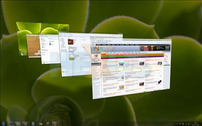
Remember Aero Flip 3D, first introduced in Windows Vista? We found it to be a classic case of form over function, and we never did get in the swing of using Windows + Tab instead of Alt + Tab. Though Aero Flip 3D remains present in 7, Microsoft has done what it should have in the first place, that is, overhauled the classic Alt + Tab application switcher.
In 7, it's dubbed Aero Flip, and as the name suggests, it makes full use of the Aero graphical interface. Instead of a row of just icons and application names, Aero Flip now shows live previews of each open application. Unlike Vista, tabbing between them puts the highlighted application into focus, whilst all others are made transparent. It allows the user to easily glance at another open window without having to actually switch to it. Another seemingly simple, but perfectly executed, example of clever user interfaces.


