Evolution of Windows Media
Having examined Windows 7's user interface, part four of our review will turn its attention to the media experience.
The modern PC, used for a multitude of tasks, remains a key part of the multimedia experience for millions of users. Having introduced support for full-motion video in Windows 95, Microsoft has since pushed on in an effort to provide the ultimate in PC-based multimedia functionality.
However, despite Microsoft's best efforts, the multimedia powerhouse of today's industry is undoubtedly Apple's iTunes. Since its relatively recent arrival in 2001, iTunes - accompanied by the hugely popular iPod and iPhone devices - has become a dominant force in media and media distribution. Early in 2009, 70 per cent of worldwide digital music purchases took place via the iTunes store, according to market research companies.
Microsoft, it seems, has missed a beat, and the company's core multimedia software solutions - Windows Media Player and Windows Media Center - have for years remained nothing more than adequate. Does Windows 7 raise the bar?
Windows Media Player 12
Windows Media Player has been a multi-function utility at the heart of Microsoft's Windows operating system since the introduction of Windows Media Player 7.0 back in the year 2000. Fast forward nine years, and Windows 7 now introduces the latest iteration - Windows Media Player 12.
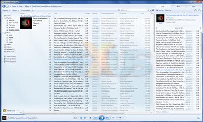
Like many features in 7, Windows Media Player 12 doesn't look too dissimilar to the prior version found in Windows Vista. Users familiar with Windows Media Player 11 should feel right at home, but, as we've commented before, you'll soon begin to notice the differences.
Firstly, Windows Media Player 12 takes full advantage of the Libraries introduced in Windows 7. Users are no longer required to select a set of folders for the media player to watch for content, instead, a user's multimedia library is populated via the content of 7's default media Libraries; music, pictures and video. The new functionality helps ease media management and it's a useful tool to have - however, those who aren't taking to the Library functionality may be disappointed to hear that there's no manual alternative: it's either the Library way or the highway.
Once populated, library management in Windows Media Player 12 is similar to that of version 11. Although the UI, in keeping with 7's cleaner, simpler ideals, has undergone a few minor changes, there's little to get excited about. Hovering over a track in the library will allow users to preview songs, but whilst that's a nice touch, one previously useful tool has been completely cut from Windows Media Player 12's feature list; the Advanced Tag Editor.
With the Advanced Tag Editor dropped, changes to ID3 tags must now be made within the library view by right clicking an item and selecting edit. It's a far less convincing method, and makes hard work of what should be a simple task. Adding album art, for example, isn't as intuitive as it once was.
The available functionality is very much a representation of the product's name, this is a Media Player and not by any means a fully-fledged media manager. As a Media Player, though, it does have a few new tricks up its sleeve.


