A New Way Of Thinking
"Windows 8 is guaranteed to disappoint nearly everyone"
"Things that used to be incredibly simple are very complicated and hard"
"When it comes to the traditional customer base, the office computer user, they’re essentially being thrown under the bus"
Searching the web for more information about Windows 8 tends to pick up a common trend; some people don't like it. The above snippets are taken from journalists and industry experts, and there's plenty more where that came from - Microsoft is facing a backlash. But is Windows 8 really that bad?
Before we attempt to answer that, we need to put our opinion into context. I'm a Windows user and have been for some time. Since Windows 95, I've looked forward to each new release, and though I've liked some versions of Windows more than others, I've been eager to try and use each and every revision. I've tried Linux, I've tried Macs, but I always find myself coming back home to Windows... I'm a PC, and old habits die hard.
I do most of my work on a self-built desktop with multiple monitors, my files are all stored on a network-attached storage device, and if I'm travelling I take my five-year-old Dell Inspiron 1520. It's built like a tank and isn't the prettiest, but it's a great workhorse now that it's armed with an SSD. I have an iPad, but find little use for it outside of the occasional session of light web browsing, and I use a BlackBerry for my smartphone needs - the app selection is dire, but it still handles my email perfectly.
I'm surrounded by technology, but in many ways I'm a simple user; I appreciate familiarity, and all of the devices I own just seem to work. That last word is key, as I rarely play games and I'm not registered on Facebook, if I'm on my PC, I'm inevitably working. This context matters, because Windows 8 is designed for millions of consumers who will use it in various ways. Opinions will be mixed, but at least you know where I'm coming from.
Goodbye, Start Menu, Hello, Start Screen
Even the smallest change to the Windows interface can result in a public outcry. And if the combined taskbar in Windows 7 got your goat, consider this; Windows 8 has no Start menu.
Every Windows user knows that the shiny little button in the bottom-left corner is the gateway to everything, it's the button that opens all doors and over the years it's become a powerful utility. Well, scrap all that, in Windows 8 it's gone. That one change is hugely significant, firstly because people don't like change, and secondly because there are over a billion people using Windows. You do the maths.
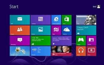
Instead, Microsoft now has a Start screen that sits front and centre. Taking up every last inch of desktop real estate, this full-screen menu is the first thing you'll see when you turn on a Windows 8 device.
Here's how it works. The Start screen consists of numerous square or rectangular live tiles presented in a grid and designed to provide two functions; they're a shortcut to a specific program/app, and they can display at-a-glance data that's relative to the tile. The mail tile, for example, can notify you of new items in your inbox, while the calendar tile can you keep you up to date on what's happening today without having to actually open the calendar.
A Window To Your World
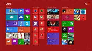
The Start screen is a notification centre and a shortcut menu in one, and it works particularly well. Microsoft's design is beautiful in its simplicity, with clean lines and bold colours, and the level of customisation makes it easy for users to tailor the Start screen to their personality. Each live tile can be adjusted in size - between a small square or a larger rectangle - tiles can be dragged and dropped to different locations, they can be placed in groups, and they can be easily removed, all at the click of a few buttons.
What's clever is the way in which the Start screen evolves over time. It starts life as a random selection of brightly-coloured tiles, but through everyday use it transforms into a wall of information that's relevant to you.
The Start screen becomes a window into your own world, and Microsoft should be applauded for creating something that's new, unique and very personal. It's arguably the most attractive front-end currently available on desktop or tablet, but great software should be intuitive and easy to pick up. Microsoft's biggest problem is that Windows users - be they experienced or not - are likely to find the Modern UI a mystery.


