BBC Sport online gets major redesign

by Steven Williamson on 1 February 2012, 14:41

Tags: BBC

Quick Link: HEXUS.net/qabb3n

Add to My Vault: x

For the first time in over a decade, the BBC has redesigned the BBC Sport website to brace itself for the London Olympics and make it more user-friendly across the full range of web-enabled devices.

BBC Sport online now sports a much cleaner design which is easier on the eye and more intuitive to navigate and search for content.

Tabs running across the top of the new look site gives users quick access to content on their favourite sports, while the main news now runs down the centre of the page. Feature boxes down the right-hand side provides live scores and radio commentaries, while the left-hand side showcases the showcase news story along with video and audio links, comment and analysis and BBC Sport Tweets.
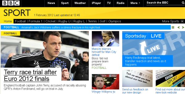


In a statement revealing the new look, the BBC says that the redesign reflects "the changing needs of sports fans as more and more licence-fee payers go online to get up-to-the-minute updates on the biggest sporting events, as they happen."

The BBC Sport website, which reportedly attracts 11 million visitors per week, plans to provide comprehensive coverage of the London Olympics this summer with 24 lives streams running at any one time.

The redesigned site has launched worldwide today.


HEXUS Forums :: 21 Comments

Login with Forum Account

Don't have an account? Register today!
Aghh, my eyes! It burns, it burns!!
“easier on the year”

Have I missed a pun there Steven?

Anyway, I think it's absolutely horrific. I really liked the previous redesign, thought it was functional and very clean. This by comparison looks really clunky and skewed, with nothing lining up properly. The cut-out headline pictures in particular are really nasty. There are whacking great gaps all over the place, content that doesn't fit properly, text that is miles too big for a typical webpage. Overall, there just isn't enough focus on the article itself. I didn't browse to see other websites' coverage of the same issue, or a quote in a black box, or more features, or whatever the heck else… I just want to see the article.

Unless they change it I think I'll just start adblocking all of the nonsense and hope the article fills the space that's left :(
BBC Sport online now sports a much cleaner design which is easier on the year and more intuitive to navigate and search for content.

Unless “cleaner design” means “gives you a headache”, I'm not convinced that they've achieved their design targets… I'm also not clear on how making things a garish yellow and complicating the page structure with excessive graphics is “more intuitive to navigate”. The old design - a main central column with a headlines sidebar - seemed pretty intuitive as it was…

EDIT: and argh! central headline column? What?!?!? Do they know nothing about page scanning theory and visual ergonomics? That's awful…
Gutted, I used BBC sport on a daily basis and although I felt the news pages for individual teams were not all that clever, I always appreciated the simplicity of the design. Sky Sports was a website that always did over do the design, now I feel BBC have headed in that direction, but the yellow burns the eyes!
As with the redesign of the BBC homepage that no one liked, the BBC has no listened and made a mess of the sports page too.

Bet the hits on the BBC website will slowly drop. Also these redesigns are not friendly on mobile devices.