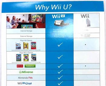
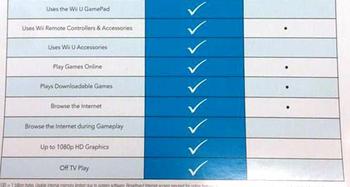
The marketing department at Nintendo has been working overtime to come up with a way to get more Wii U consoles shifted. At the end of last week we reported on Nintendo UK meeting with worried retailers and that Big N had a plan, even a vision, to present to retailers “in the coming weeks” with a strategy to help build “Wii U momentum over the course of 2013”.
Now, with the image of this new marketing flyer on the screen in front of me, I am imagining someone in the Nintendo marketing department piped up in a meeting to say “I know, let’s print a flyer” and without any better ideas being volunteered, this got produced. Take a gander at it below.
The flyer is entitled “Why Wii U?” and is in the form of a checklist comparing the Wii U and Wii consoles. All the features of the Wii U are listed with a big tick. If the Wii shares the highlighted feature, there’s a tiny dot to denote that, otherwise the comparison check box is left blank. Geoff Keighley of GameSlice.com picked up the flyer from a retailer at the weekend and commented, via his Twitter account, that he was “speechless”.
So how does the new Nintendo flyer/poster sell people on the idea that buying a Wii U may be a better thing than buying a much cheaper Wii console? It doesn’t really, and that’s the point and why Keighley, above, was speechless.
If you are designing a marketing communication to sell something you will usually highlight the best stuff at the top. The top of Nintendo’s new marketing checklist boasts of improved internal and external storage capacity for the Wii U. The next two items in the list show us what games are played on each system. Both play Wii games, while only the Wii U can play Wii U games... Not surprisingly there is no checkbox for GameCube compatibility on the list; GameCube discs aren’t playable on the Wii U. (Though they can be downloaded.)
Oddly placed, almost near the bottom of the list Nintendo has decided to mention the HD graphics capability/support built into the Wii U. Aren’t better graphics one of the major reasons people upgrade to new consoles? Especially as compared with the Wii’s contemporary competition, graphics were a weak point. Overall, this poster/flyer looks ill conceived and badly executed.


