Microsoft has announced Windows 10 Insider Preview Build 20161. In a blog post about the latest tester release Senior Program Manager, Brandon LeBlanc, highlights some of the biggest changes coming to Windows 10 and up for test in this build. However, he reminds readers that features tested in these previews are not necessarily going to be in the next version of Windows 10 for general release. Furthermore, the features talked about below will be tested by a subset of insiders to start with.

Start Menu changes
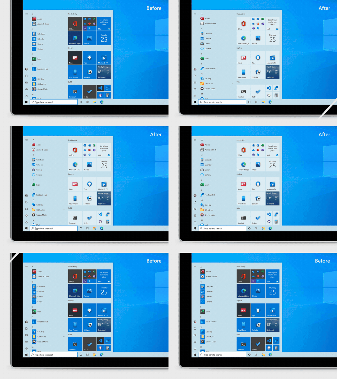
This isn't the big revamp of the Start Menu we have seen / heard about in the previous months. This insider build doesn't abolish Live Tiles, or introduce a Windows Lite Start Menu option. Rather what we can see in build 20161 is the introduction of Theme Aware tiles in the Start Menu.

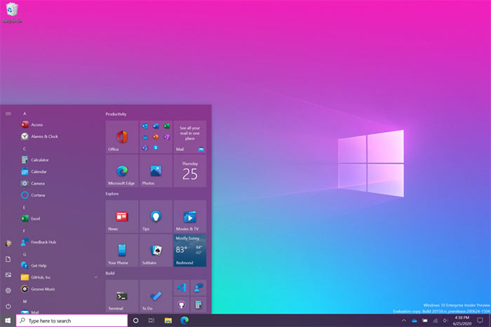
This more "streamlined design" removes the solid colour backplates behind logos with a uniform translucent effect. Le Blanc says this makes Microsoft's 'Fluid Design' icons look better. Additionally users can toggle between light and dark modes - or for an added bit of flvour, apply their chosen Windows accent colour (see image above) to the menu/tiles.
Microsoft Edge tabs selectable via Alt+Tab
An interesting change for Microsoft Edge users is available via the Settings > System > Multitasking dialogue. Here you can configure Alt + Tab to only show your last three or five Edge tabs or choose to turn this feature off completely. Again this feature is under test with a subset of insiders.

Other tweaks
Some other tweaks in Preview Build 20161 worth a mention include; the introduction of a more personalised Taskbar for new users, improvements to the notifications experience, the bringing of more Control Panel capabilities into the Settings app, improvements to the tablet experience for 2-in-1s, and the roll out of the Windows Calculator graphing mode. You can read more about these changes, tips for developers, and a host of bug fixes on the Microsoft Windows Experience Blog.


