Better right click menus in Windows
Microsoft's right click context menus are undeniably useful. It is also good how it left the shell extension open so that third party software developers could put in quick and useful right click options. However, in Windows 10 and earlier this same menu could become very long, cluttered, and seemingly unorganised, with multiple level fly-out submenus too.
With the above in mind, Microsoft set out to improve the context menus in Windows, and decided to address the following seven common and potential issues:
- The most common commands – cut, copy, paste, delete, and rename – are far from the mouse pointer, touch point, or pen.
- The menu is exceptionally long. It has grown in an unregulated environment for 20 years, since Windows XP, when IContextMenu was introduced.
- It includes commands which are rarely used.
- Commands that should be grouped together – such as Open and Open with – are sometimes far apart.
- Commands added by apps have no common organizational schema and can interrupt sections of inbox commands.
- Commands added by apps are not attributable to the app itself.
- Many commands run in-process in Explorer, which can cause performance and reliability issues.
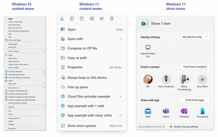
In a blog post about the new context menus, Microsoft says how it has tackled the above. Many solutions are obvious ones, like grouping together common related items, and the use of verbs to decide on fly-out menus/items. The images above show the difference Microsoft believes can result from its new context menu strategy.
Another interesting change highlighted in this new blog post is the improvement to the share menu. I find the current Windows share menu options almost useless, unlike on my mobile, so this is good to see. Hopefully this dialogue will improve with intelligently sorted frequent contacts and sharing methods.
SeriousSAM 0-day vulnerability
Microsoft has detailed a workaround for a rather serious security flaw, dubbed SeriousSAM, which could allow attackers to gain admin access on vulnerable systems. The flaw has been present in Windows since 2018, and even affects the latest Windows 11 previews.
SeriousSAM, AKA CVE-2021-36934, is described by Microsoft as follows: "An elevation of privilege vulnerability exists because of overly permissive Access Control Lists (ACLs) on multiple system files, including the Security Accounts Manager (SAM) database," and it presents the following problems: "An attacker could then install programs; view, change, or delete data; or create new accounts with full user rights." However, it is noted that an attacker must have some level of local access to the computer in order to exploit this vulnerability.
To protect systems from exploits based on this flaw, Microsoft recommends the two actions detailed below, but Bleeping Computer says users should be aware that removing shadow copies might impact subsequent system and file restore operations:
Restrict access to the contents of %windir%\system32\config:
- Open Command Prompt or Windows PowerShell as an administrator.
- Run this command: icacls %windir%\system32\config\*.* /inheritance:e
Delete Volume Shadow Copy Service (VSS) shadow copies:
- Delete any System Restore points and Shadow volumes that existed prior to restricting access to %windir%\system32\config.
- Create a new System Restore point (if desired).
It might be wise to wait before doing the above, as Microsoft says it is working on a patch for the vulnerability, which will likely be issued as an out-of-band security update shortly.


